

- Published on
Building a Beautiful OKR with AntBlazor - Part 3
- Authors

- Name
- Luke Parker
- @LukeParkerDev
Setup AntBlazor
Before we can get started using the many great components provided by AntBlazor, we have to first install it and follow the setup steps.
NuGet
Using your package manager, add a reference to the latest version of AntDesign in the project OKR.Web
Blazor Boilerplate
Now with the package installed, we have to reference the assets and add a few modules to the dependency injection.
Add to OKR.Web/Pages/_Host.cshtml, just before the <head> tag closes:
<link href="_content/AntDesign/css/ant-design-blazor.css" rel="stylesheet" />
<script src="_content/AntDesign/js/ant-design-blazor.js"></script>
This references the default CSS file - you can replace it to easily get dark mode, or a custom theme. There is also some JS interop required hence the import.
OKR.Web/Startup.cs
services.AddAntDesign();
This is an extension method provided in the library, which adds the services all in one clean call. Some of the services added here is the message service, modal service, etc.
OKR.Web/App.razor
<AntContainer />
At the bottom of the file add this line, this allows the popups to run globally and persist on page changes, as well as other uses.
Finally, we need to add the AntBlazor namespace to the Blazor component imports:
OKR.Web/_Imports.razor
@using AntDesign
That's it! We are now ready to build with these enterprise grade components.
Removing Bootstrap
A small caveat of the Blazor template provided by .NET is that all projects begin with Bootstrap and Open Iconic. The CSS file conflicts with AntBlazor and causes some centring issues.
As we aren't using Bootstrap or Open Iconic in this project at all, we can just delete both of them completely:
- OKR.Web/wwwroot/css/bootstrap
- OKR.Web/wwwroot/css/open-iconic
Removing Unused CSS
Now that there is no bootstrap, there was some custom CSS that we don't use, so lets clean it up.
OKR.Web/wwwroot/css/site.css
  #blazor-error-ui {
      background: lightyellow;
      bottom: 0;
      box-shadow: 0 -1px 2px rgba(0, 0, 0, 0.2);
      display: none;
      left: 0;
      padding: 0.6rem 1.25rem 0.7rem 1.25rem;
      position: fixed;
      width: 100%;
      z-index: 1000;
  }

      #blazor-error-ui .dismiss {
          cursor: pointer;
          position: absolute;
          right: 0.75rem;
          top: 0.5rem;
      }
Delete everything from the file leaving just the Blazor error UI - which is the bar on the bottom.
Using Forwarded Headers
As we are proxying from HTTPS/domain to the project using NGINX, the application needs to change the pipeline so that redirects are correct, and HTTPS is correctly detected. We also don't need to force redirects to HTTPS as it is already forced using NGINX.
Just before app.UseStaticFiles(); add the following:
OKR.Web/Startup.cs
app.UseForwardedHeaders(new ForwardedHeadersOptions
{
    ForwardedHeaders =
        ForwardedHeaders.XForwardedFor | ForwardedHeaders.XForwardedProto
});
Then, delete the redirection: app.UseHttpsRedirection();
Verify AntBlazor is Working
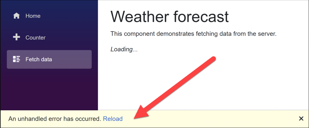
Inside of Index.razor, there is currently a simple 'Hello World', lets test everything is working correctly by displaying a simple button:
OKR.Web/Pages/Index.razor
<Button Type="primary">Primary</Button>
You should see the following:
If you got this far, you are doing great!
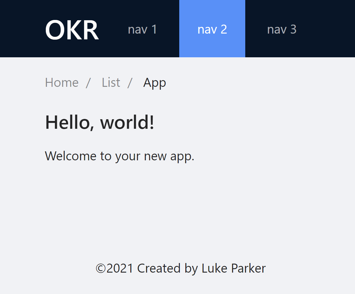
Designing the Main Layout
The AntBlazor documentation is great, it provides many examples of how to setup a typical layout.
For this project, at least initially we don't need a complex setup, but for future proofing we can include a menu bar, with navigation, as well as a simple content area for our page (anything with a route) components.
Lets replace the OKR.Web/Shared/MainLayout.razor with the following (using AntBlazor components)
@inherits LayoutComponentBase

<Layout Style="min-height: 100vh; width: 100vw">
    <Header Style="display: flex; align-items: center;">
        <Title Level="2" Class="ant-menu-dark ant-menu-submenu-open" Style="padding: 0; margin: 0 12px 0 0; color: #ffffff">OKR</Title>
        <Menu Theme="MenuTheme.Dark" Mode="MenuMode.Horizontal" DefaultSelectedKeys=@(new[]{"2"})>
            <AntDesign.MenuItem Key="1">nav 1</AntDesign.MenuItem>
            <AntDesign.MenuItem Key="2">nav 2</AntDesign.MenuItem>
            <AntDesign.MenuItem Key="3">nav 3</AntDesign.MenuItem>
        </Menu>
    </Header>
    <AntDesign.Content Style="padding: 0 50px;">
        <Breadcrumb Style="margin: 16px 0;">
            <BreadcrumbItem>Home</BreadcrumbItem>
            <BreadcrumbItem>List</BreadcrumbItem>
            <BreadcrumbItem>App</BreadcrumbItem>
        </Breadcrumb>
        <div>@Body</div>
    </AntDesign.Content>
    <Footer Style="text-align: center;">©2021 Created by Luke Parker</Footer>
</Layout>
Your layout should look similar to this:
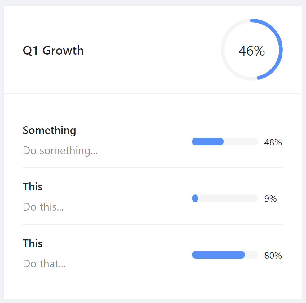
At this point we have a consistent visual story without thinking and we can begin designing the OKR cards. For the dashboard, we should have an overview of each OKR. The perfect component for this is the Card.
Before we get started however, we need to build a view model to act as an aggregate object of the object and all the key results.
Create a file: OKR.Web/ViewModels/OKRViewModel
public class OKRViewModel
{
    public Objective Objective { get; set; }
    public IReadOnlyList<KeyResult> KeyResults { get; set; }
}
At this point we can assume that the OKR Card component will take a single OKRViewModel - where this data comes from right now doesn't matter.
Lets create OKR.Web/Shared/OKRCard.razor
@using OKR.Web.ViewModels
<Card Bordered="true" Hoverable="true" Class="okr-card"
      Title="@(OKR?.Objective.Title ?? "Loading...")">
    <Extra>
        <AntDesign.Progress Type=ProgressType.Circle
                  Percent="@((int)_completion)"
                  Size=ProgressSize.Small />
    </Extra>
    <Body>
        <AntList DataSource="@OKR.KeyResults">
            <ListItem>
                <ListItemMeta Description="@context.Description">
                    <TitleTemplate>
                        @context.Title
                    </TitleTemplate>
                </ListItemMeta>
                <div style="width: 35%">
                    <AntDesign.Progress Percent="@((int)(context.Completion * 100))" Size="@ProgressSize.Small" />
                </div>
            </ListItem>
        </AntList>
    </Body>
</Card>

@code {
    [Parameter]
    public OKRViewModel OKR
    {
        get => _okr;
        set
        {
            _okr = value;
            _completion = value.KeyResults.Average(keyResult => keyResult.Completion * 100);
        }
    }

    private decimal _completion;
    private OKRViewModel _okr;
}
Note that there is the Class property, instead of class. This is a custom AntBlazor property that passes the parameter to the real HTML element, which is very useful for custom styling.
Try running it, and you should get something that looks like this:
In this post we got started with building a component using the AntBlazor library. In the next post, I continue the UI layout with AntBlazor.